
The Accolent ERP Power BI Inventory Valuation Dashboard provides extensive inventory valuation data that is automatically refreshed from your Accolent ERP database daily. The Power BI Inventory Valuation shows inventory valuation by warehouse by month with date range and warehouse slicers. As of a valuation date, you can easily identify and rank top and bottom products and see all inventory valuation data by warehouse by product.
Inventory Valuation Dashboard
- Open the Power BI Inventory Valuation Dashboard.
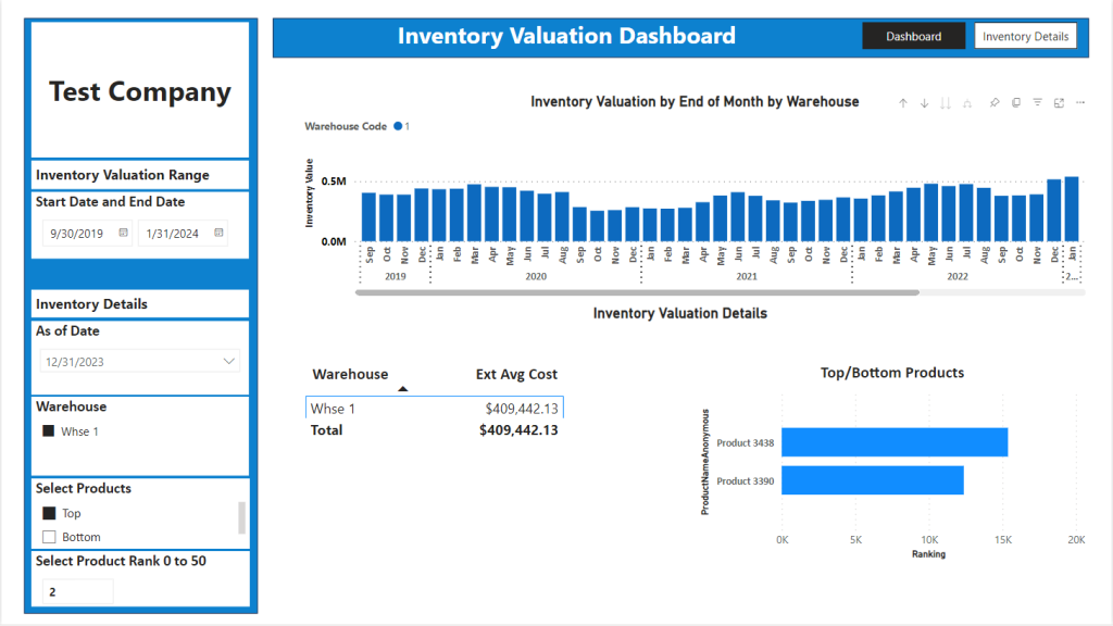
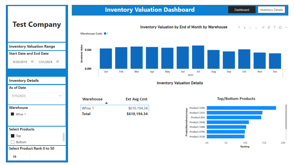
- The selected Start and End Date range on the left panel indicates the range of the inventory valuation data that is being considered.
- The graph at the top right displays the Inventory Valuation by month by Warehouse for the selected Date Range based on Average Cost – in this case there is only one warehouse but if there were multiple warehouses they would show as stacked bars.
- The grid at the bottom left shows the Inventory Values for selected Warehouses on the As Of Date selected in the left panel under Inventory Details.
- The bottom 2 selections at the bottom of the left hand panel control the breakdown by Product – select whether to look at top products or bottom products and select how many products to display.
- The graph at the lower right displays the ranking of the top/bottom Products by Extended Price over the Date Range – by changing the Rank you can display up to the top 50 Products.
Drill Ups and Drill Downs
- Hover over the top graph to see the drill up and drill down options.
- Click the upward-facing drill up arrow to see the data by year rather than month.
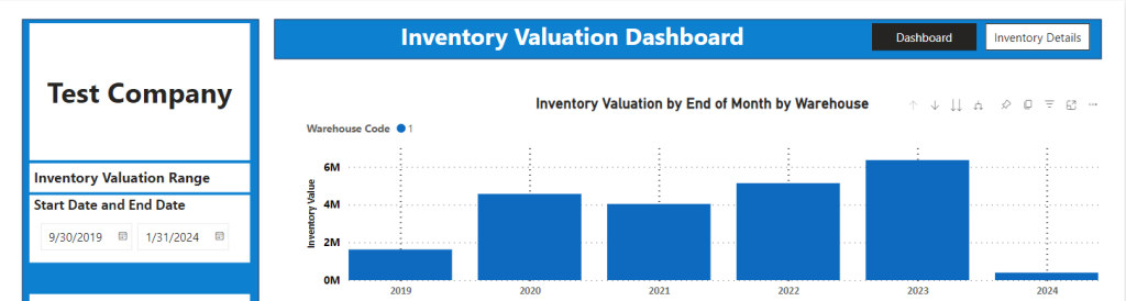
- Click on the downward facing drill down arrow and then click on 2023 (say) to select.
- The display now shows 2023 by month.
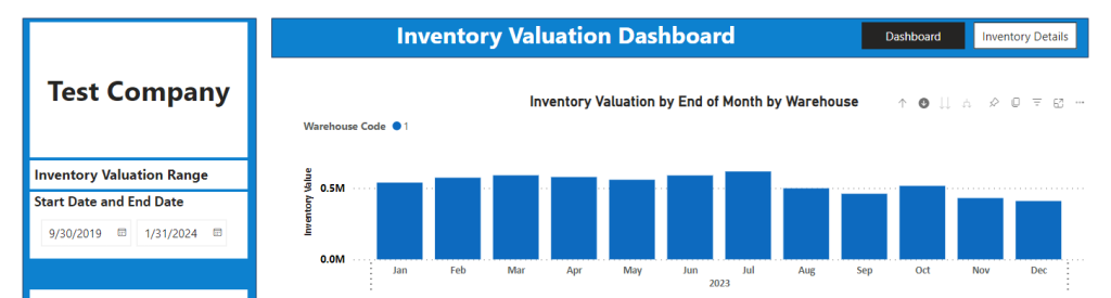
- Hovering over any month (e.g. Jul 2023) shows the actual data.
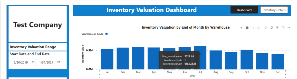
- Change the As of Date in the Inventory Details section to see the Inventory Value by Warehouse and the top Products for that date.
- In this case Sales by Month is the lowest level of the data but if there were a lower level of data (e.g., sales by week) then clicking on the double downward facing arrow would display a lower level of data.
- And the split downward facing arrow would drill down to a further level.
Inventory Details
- Click on the Inventory Details button.
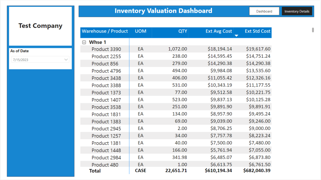
- This grid breaks out the Inventory Value by Warehouse by Product on the As of Date selected.
- In this case there is only one Warehouse but if there were multiple Warehouses click on the Plus button to expand.
- The UOM and the Qty shown in the Totals by Warehouse are not meaningful, but the $ totals for Extended Average Cost and Extended Standard Cost are.
Additional Reports
- Using the datasets that underly the Power BI dashboards, users can create their own reports and/or dashboards.
- They can also pull in data from other external data sources as needed to add to the datasets.
- We are available to provide Professional Services to create or modify reports or assist as needed.