
Accolent ERP includes several KPIs (Key Performance Indicators) that deliver graphical visualization dashboards for important performance metrics. All the data is summarized as of the end-of-business on the prior day and cached to improve performance. The accounting dashboard shows the (1) Accounts Receivable balance as of the date of the dashboard compared to the same day of the month in the prior month, (2) Accounts Payable balance as of the date of the dashboard compared to the same day of the month in the prior month, (3) AR Aging broken down into aging buckets of 0-30, 31-60, 61-90 and 90+ days measured from the date of invoice, (4) AP Aging broken down into aging buckets of 0-30, 31-60, 61-90 and 90+ days measured from the date of the vendor’s invoice (5) top 10 receivable balances by bill-to customer and (6) top 10 payables balances by vendor.
General Definitions
- All KPIs are presented as of end-of-day for the previous business day; this is the date of the dashboard shown in parentheses in the title of the dashboard
- Today means as of the date of the dashboard
- Last Month means as of the same day of the month as Today in the prior month
- For graphs, AR and AP balances are presented in $000s
- AR balances show the Amount Due calculated as the sum of Invoices less prior payments plus interest less available discounts less any write-offs taken
- AP balances show the Balance Due calculated as the sum of Vendor Invoices less prior payments less available discounts
Accounting KPI
- This is the accounting KPI
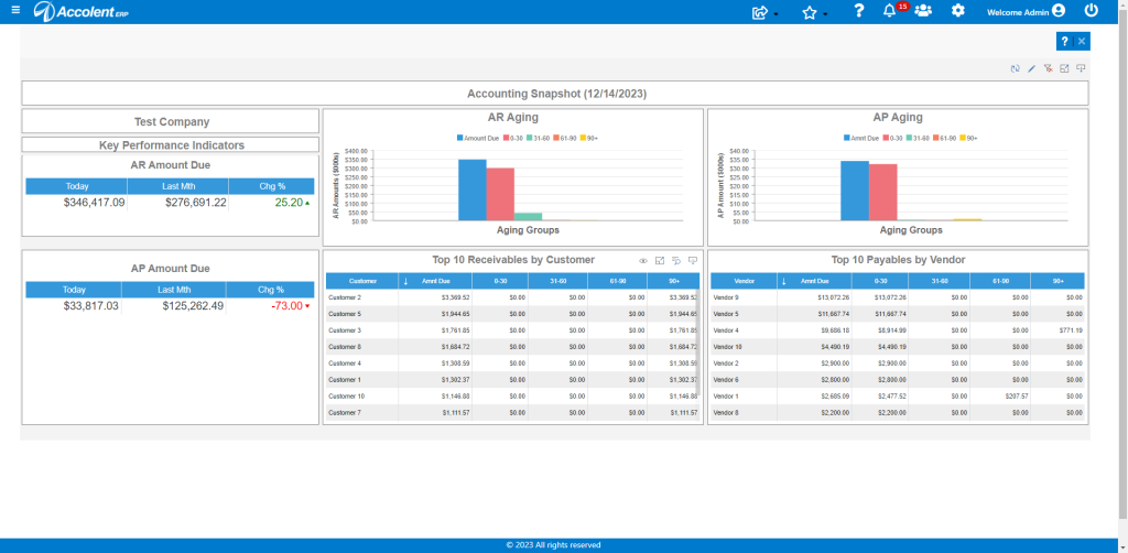
Dashboard Controls
- The icons at the top right-hand side of all dashboards provide options to refresh the dashboard, to edit the dashboard, and to filter the dashboard
- Do not edit the dashboard unless you are familiar with using the report designer
Element Controls
- Each dashboard consists of several graphical elements combined into a dashboard
- Rolling the mouse over the top right-hand side of any element provides several additional options
- The up/down arrows provide some options to sort the data
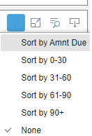
- The full screen icon allows the element to be viewed on a full screen
- The search icon provides the data being visualized
- The download icon gives several options to save the element
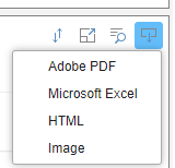
- The eye icon allows for selecting columns to be displayed or not dispalyed
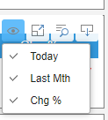
Graph Data
- All graphs have a mouse rollover that shows the actual values (in $000s)
Modifying the Dashboard
- Contact ADS Solutions if you want help modifying the sales dashboard or creating new custom dashboards
- Any standard report can be turned into a dashboard or dashboard element